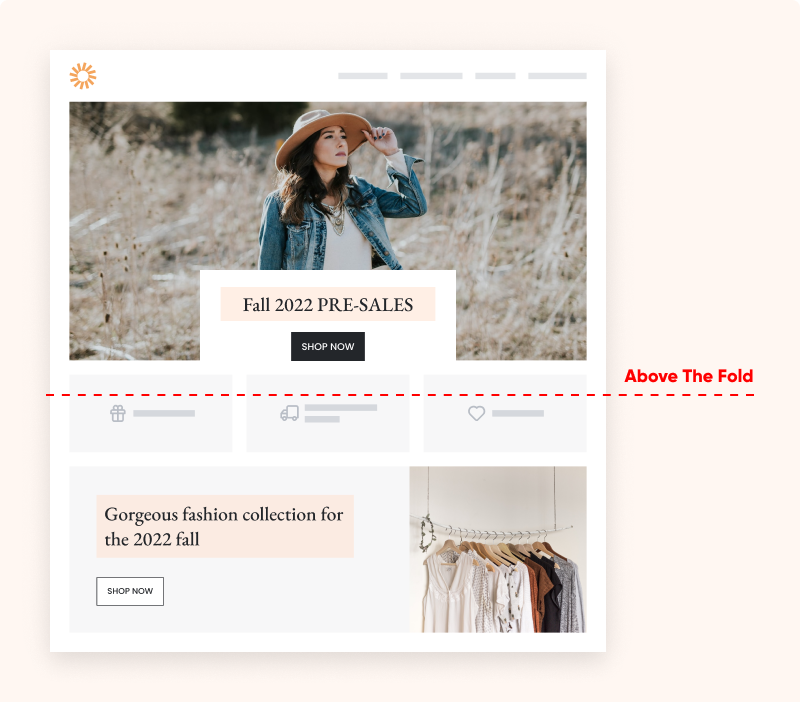
What is above the fold?
The above the fold section of a website is the content that’s shown before the user scrolls down. All the content below that is referred to as “below the fold.”
Above the fold – the history
To understand where the term “above the fold” comes from, we need to think about the times when newspapers were the main way that information got around. Newspapers were printed on very large pages and displayed on newsstands, where they’d be folded in half. This meant people walking by could only see the content above the—literal—fold!
Newspaper editors printed their most eye-catching headlines on the top half of the page to catch the attention of passersby, increasing the chances they’d purchase the paper.
In the Internet era, the goal is still the same: grab the users’ attention right from the get-go.
Why does above the fold content matter?
The content you place above the fold is incredibly important because you only have 8 seconds to catch a new visitor’s attention. If your above the fold content isn’t engaging, you’ll lose lots of visitors.
Because of its high visibility, your above the fold content should get straight to the point and clearly communicate the main content or message of your website. You can place ads, primary calls to action, or other important information above the fold.
A revealing study by Google recently showed that ads appearing above the fold were seen 73% of the time, while those below the fold were seen only 44% of the time.
How to optimize your above the fold content?
As you can tell, your above the fold “real estate” is space you definitely don’t want to waste. Here are some best practices for optimizing your above the fold content.
1. Add a catchy H1 tag
Your H1 tag (also known as the heading tag) is the first thing your visitor sees. It should be engaging and designed to hook the visitor’s attention.
You want to communicate your USP (unique selling point) and give a little teaser about what the visitor can expect further down the page.
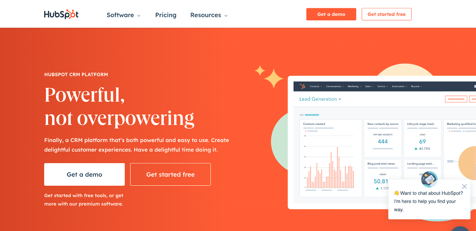
In the example below, HubSpot uses a very catchy H1 tag combined with a bold, attention-grabbing background color.
2. Use clear CTA buttons
The HubSpot example also demonstrates our next best practice— clear CTA buttons. Notice how the primary CTA button, “Get a demo,” and the secondary CTA button, “Get started for free,” are well-placed and clear?
Before you create your CTA, ask yourself: what do you want visitors to do? (Join your email list, book a call, start to use your software, etc.)
For the most powerful, effective CTA, make sure it’s:
- short,
- captures your visitor’s attention, and
- urges them to take action.
Like HubSpot, OptiMonk uses a clear CTA encouraging visitors to sign up for a free account.

3. Place important content above the fold
Since it’s the first thing visitors see, all the most vital information should be placed here. But be careful: this doesn’t mean you need to cram everything in… be selective. Curate your content carefully. Avoid huge banners, which can easily ruin your conversion rates and take up valuable space that could be used more effectively.
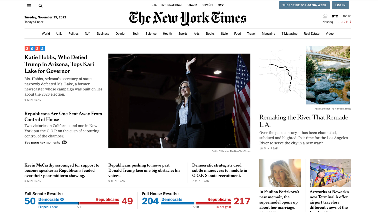
Remember to add your main keywords above the fold. And who’s more skilled at placing content than the New York Times itself?
4. Make your web design responsive
Responsive web design has a big impact on the overall user experience. Today, since most people browse on their phones or tablets, it’s absolutely crucial to make sure your web design works and looks great on all screens. Tailor the experience and your messages for all devices for the best results.